Jonathan Phillips, “Plaza Dropout”, 50 x 40 inches, oil on canvas. 1986
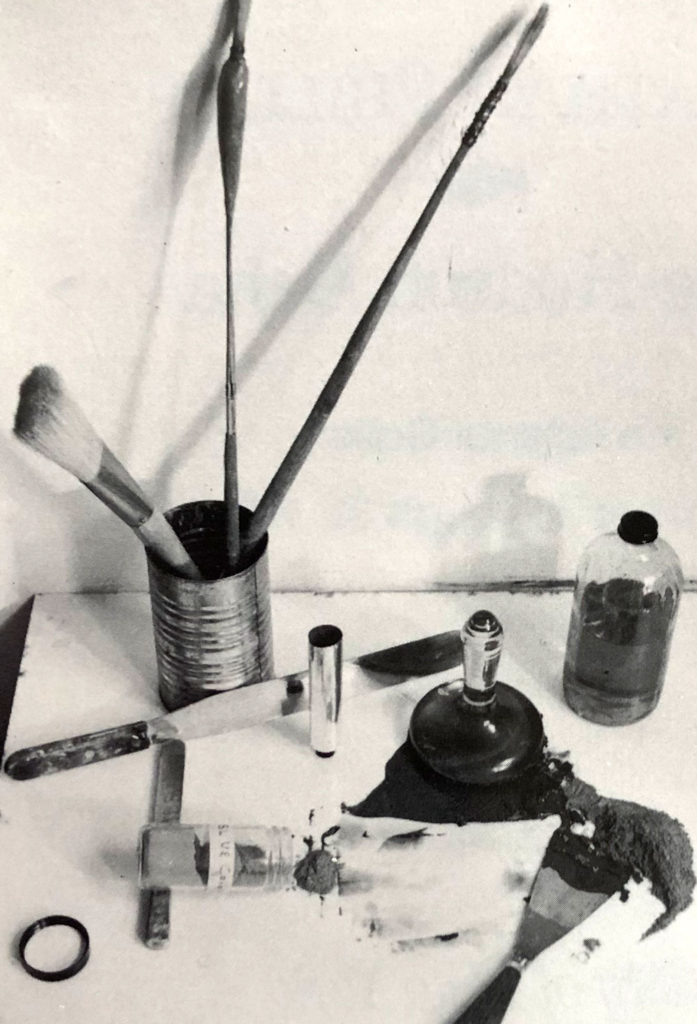
Jonathan Phillips paints with the same intensity that he grinds his pigments with, the way he fashions his Own horse hair brushes with their counter-weighted handles and tapered necks. The energy borders on obsession and the wide swath of finished canvases and works on paper attest to his sweat covered vision.
It might sound strange to some a contemporary artist, who, Merlin-like, whips up the richest palette of ultra-marines and cadmiums, grinds the concoctions into the finest of powders, sun bleaches his own oils on the studio windowsills and after all that, blends and fine tunes the batch before placing the colors in their shiny tin tubes. All that work with the Yellow Pages just bursting with art supply stores and fancy brands galore. But as Phillips says, “It’s the only way I can get maximum pigmentation.”
“A contemporary artist, who, Merlin-like,
whips up the richest palette”
Johnson Phillips, “George Washington from Ft. Tyron”, 12 x 12 inches, 1986
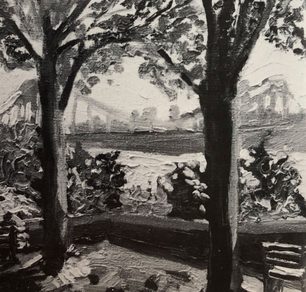
“George Washington (Bridge) from Ft. Tryon” is a one foot square oil study that explodes with color and a tapestry texture that challenges the viewer’s eye. The smoky blue outline of the horizontal span, spied from a lookout point high up in the park, is framed by a pair of solid vertical tree trunks. The compositional counterpoint anchors the lithe painting like tent pegs on a campsite. Apart from that formal device, the picture takes off in a swirl of lush brushstrokes that give the scene a perfumed air, a humid sense of summer.
 Painted on the spot, “alla prima” (or what the French call “plein air”), Phillips scouts his visual prey. The juxtaposition of the trees and the distant steel span places nature in the foreground and the work of man way off in the distance. With Phillips, it is always nature that gets the upper hand. This is a biased view and fully explored as the artist takes you from borough to borough, roaming the parks, infesting the vistas and negative spaces between the sky and curvy branches. Phillips takes his new title seriously, artist-in-residence of the Parks Department.
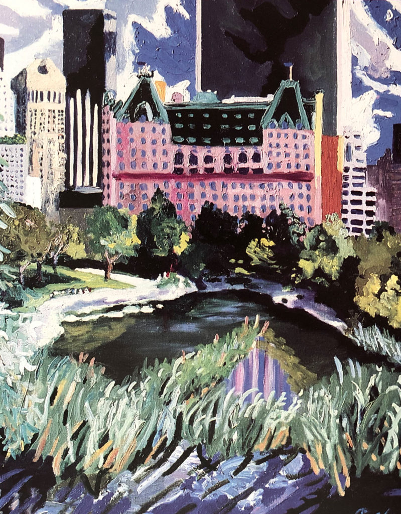
The scene shifts quickly from a peek at the Hudson River to an almost postcard view of Central Park with the wedding cake facade of the landmark Plaza Hotel shimmering due south. Now to most eyes familiar with the Plaza, the facade is creamy whites But the artist is swept away by the high noon, ‘Acropolis’ light “that is so bright but still doesn’t wipe the color away,” and lets his eye transform the Plaza in a wall of pale purple (Phillips identifies the color as ultramarine violet).
Artistic license? Expressionist deception? It is the Plaza afterall, The wind-whipped pennants on the roof line tell you ifs so. But that is the long view. The artist, set up at his easel on the blue stone arch of Gapstow Bridge, paints his surroundings, the shoots of meadow grass, the algae rich pond, the landscaped curves of the masters Olmstead and Vaux, It is a quick fix, just what Phillips needs, about an hour of “interesting light.” His white formica palette is splotched with rich dollops of pigment. The brushstrokes build up, mosaic like, luminescent as a Tiffany lamp.
The moquette, “Plaza I” is dwarfed by its studio counterpart, “Plaza Dropouts” Phillips scouts first hand and paints his study before retreating to his studio. It is a time honored technique, allowing the artistic) sniff the site, capture it in his imagination before retreating to more hospitable accommodations, (Albert Bierstadt did if back in 1859, first up in the Rockies and then back to his New York studio. And so does Neil Welliver today, tramping through the Maine woods, studio back-
pack bulging.) The Plaza grows in linen square inches. The pond expands, the grass snakes up and out. The crow’s next view from the little bridge magnifies and blossoms.
“He lets in the snarling city but he keeps it leashed,”
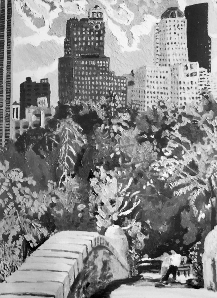
It isn’t easy to fix a label on Phillps. Realist, yes, but what kind? He shys away from tight renderings and leaves lots of air to breathe around the swaying towers that line the high density skyline of Central Park South. The funny thing is, even with the loose applications of paint that follow the mood of the “mark,” the buildings are easily recognizable. Philip Johnson’s acclaimed (at least by some), Chippendale-topped AT&T Building and the icon-like black glass tower of the Grace building (crazy with shadow), anchor the picture. But those pigmented marks that touch and curl, (some as heavy as a wet eyelash while others test the strength of the tree branch with pigment heavy leaves) make up an abstract score. Maurice Brazil Prendergast did it in “Central Park in 1903,” the hansom cabs pulled by prancing horses, women strollers twirling their parasols, merged and melted into what one critic called a “palette of crushed jewels.” There is a sharp difference though. Phillips never veils the bucolic surroundings. He lets in the snarling city but he keeps it leashed.
It is tempting to place this artist with some group or align him with a historical movement. With his painterly theme of the “Hudson Delta” and his fondness for places like Bear Mountain, it might work, placing him as a new wave Hudson River School painter. Asher Durand would probably object, frowning behind heavy whiskers and a sun-defying brimmed hat. Perhaps then, the American Impressionists, who formed a colony of sorts in southern Connecticut in the late 1800’s, not far from where Phillips paints poetic backyard scenes. Twachtman and Weir gravitated to Greenwich, Hassam and Griffin painted in Old Lyme and Charles Harold Davis could be found in Mystic. But that was way back. Phillips prefers Monet (sensibly) and would even be crazy about Matisse if that master had used more paint. Still struggling for a friendly cubby-hole, the Social Realists come to mind, or even their predecessors who ganged up to form the Ash Can school. Again there are barriers.
Phillips does not paint soup kitchens or down and out scenes although they still exist in uncomfortable numbers. Like Marsh’s love of Coney Island, Phillips is mad for Central Park. But not the figure. He puts an entwined couple on a familiar park bench but they are nearly invisible against the avalanche of oscillating color.
Johnathan Phillips, “Gapstow Bridge”, 50 x 40 inches, oil on linen, 1986
Phillips is a loner, skirting the edge of painterly realism with exuberant dashes of abstract expressionism. He jousts with the paint. “I don’t work against a sketch or outline,” says the artist. “I don’t light compose in fragments. I don’t count my brushstrokes. I respond to the gesture of the mark.” Fighting words. Rejecting the compulsion of the realists but leaving meditative room for the Chinese landscape painters. The label remains, hanging in sticky limbo. It’s really just a question of the light.
Giddy with light, flurries of color glow and spark off one another. A curving pathway becomes as bright as a sandy beach, cranking up the medley of greens that surround it, darting back from a long shadow that glides along the pond like a Venetian gondolier. The light and the wrist-flick- ing touch of the brushstrokes feel French but not in a self conscious way. Phillips is picky. Conditions have to be just so. His critical eye must be moved (“If there’s hope in the sky, go out.”) and that concern carries from scenes in Central Park to vistas of Prospect Park and back across the East River to his studio filled with north light, under the spell of the Empire State Building.
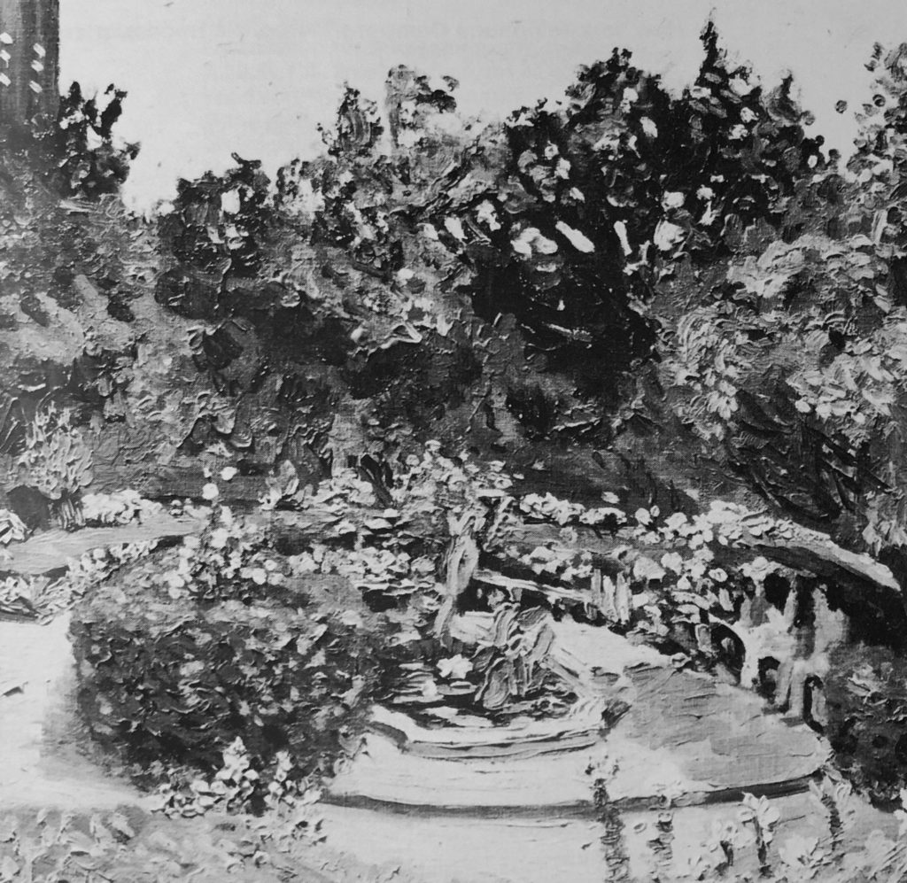
Jonathan Phillips, “Conservancy Garden”, oil on linen, 18 x 18 inches, 1986
It is a shock to see his sophisticated interiors and the ambitious still lifes. “Jumpin Blackfish III” is barely contained in a cast iron skillet. So many objects and designs vie for attention. The hypnotic lozenge of building reflected light illuminates the composition. As if eyeing the glistening blackfish, a slim bottle of tabasco sauce grazes the edge of the table top, blazing away with a blinding pattern of blue and white stripes. If these contrary combinations were not enough — and there are many more a teeth grinding orange shade backdrops the still life element. Who has the nerve to place in such close proximity the peppery red liquid and the fluorescent orange drape? Phillips of course.
One last view: a long one, crouched down on the scarred 26th Street Pier. It is a crumbling industrial landscape that has already changed since the artist painted it in 1981. Crumbling except for the breathless expanse of blue sky gridded with wispy formations of white clouds. It is a wide vision, broken up into three panels so the viewer gets a feeling of the waterfront, the river, the big view east as if the city was a rambling frontier town, not hopelessly choking in gridlock.
So much like Olmstead’s vision of Central Park, Phillips believes in “rus en urbe,” a bit of country in the city, a bouncy counterpoint to the honking madness and vertical real estate wars outside the park’s sculpted and tranquil 843 acres. The artist wants you to breathe and feel that air, to take in the myriad species of tress and flowers and the wonderous amalgam of bird species. Borrowing a few lines from J. Brooks Atkinson’s “East of the Hudson,” the exuberance of Phillips’ far reaching palette strikes home: “To be aware of the birds in New York City, therefore, was to be aware of free life that beggared the luxury of the Paramount Building and reduced Peter Minuit’s transaction to
an incident in time to hear the innocent voice of the little yellow prairie warbler compete with the whirr of traffic through Central Park—reclaimed a man from civility. They were worth our high tax rate although they cost nothing.”
After seeing Jonathan Phillips’ paintings, the Plaza will never look the same.